This week's lab focused on geo- referencing, where by we take un-referenced data (i.e. no geographical projection). We had to take raster data create a reference for it. The data consisted of aerial photos of the UWF campus near Pensacola, Florida. For our purposes we referenced in a basic but effective way. And as beginners in GIS, basic is where we start.
The process works by adding data that is already referenced. In this case, polygons and polylines of roads and buildings on the campus. We then added the raster data. Of course the raster doesn't line up. So we enabled the georeference tool bar. (Everything in ArcGIS comes down to the toolbar). In the tool bar we can first get the raster data to appear in the same space as the buildings/roads layer by selecting Fit to Layer. Then we enable the points. Using the buildings/roads layer, we can connect various points to points on the raster data. I can see the corner of a building, and connect it to it's corresponding polygon. You need to start with the unreferenced data and link it to the referenced data. You need to have at least 5 points.We can then check something called the RIMS error, this will tell us how close those two points are. The error should be under 15. I was able to get the error around 4 on the first raster while still making sure it looked accurate. Having it look accurate is as important as getting a good error value. So one needs to find the right balance. This balance is helped along by using polynomial transformation. There are three levels and the transformation helps to warp the raster data to the points. It can help create a more accurate look but if you use higher levels (as I discovered) it can stretch the raster out and distort it in various ways. The northern half of UWF used a level 1 transformation where as the southern hald used a level 2. Level three really distorted the image. After creating and deleting links I finally got something I felt good with.
We then had to create a buffer zone around an Eagle's nest using the multibuffer tool. This was the easiest part. Input, ouput boom...buffer zone! multi because we created two in one, 330 ft and 600 ft. There was no base map for where the eagles nest is. So I had to add a basemap..for some reason, every time I exported it as a jpeg, it distorted and created a pixalted green mess. I couldn't figure that out. We also used the editing tool to digitize shapes on the map. In our case, the gym and a road. The road was a polyline and the gym, a polygon. I had done this in the past using one of the free ESRI courses which has you digitize a lake. The tool is a little tricky. With the gym, I first tried making a square for each part of the building, but it was hard to line them up and merge them. I went on YouTube, find a viedo and realized there was a way to do it in one sweep...make a lot of little points that match the outline. Though, it didn't come out perfectly, I felt like it worked great.
The next part was the part that you can impress people with the most...no one cares that can you do an awesome job analyzing the best place to set this up or geo code, no the thing that gets the lay people interested are 3D maps! We put our now referenced raste data along with a DEM feature class in Arc Scene. Using the DEM plus the base heights of the buildings we were able to create a 3D map of UWF. This is actually a fun process that I really enjoyed in my Carto class. And your friends often say...ooooh...aaahh....even though in reality the process do it is quite simple despite the number of steps.
Overall this lap helped us to better understand some of the basic mechanics of ArcGIS and how georeferences can be created when none are found. As I near the end of the course, I feel more confident in using ArcGIS...I'm also happy I saved all of those pdfs on my pc so I can look them up when in doubt!
Showing posts with label ArcGIS. Show all posts
Friday, April 8, 2016
Sunday, March 27, 2016
Dot Pop!
This weeks class focused on creating a "dot density" map. Essentially, it's a map that has a lot of little dots that represents certain data (in our case, one dot representing many, one-to-many). We had to create a map showing population density in South Florida. Each dot represents 5,000 people. The interesting part about dot mapping with one-to-many dots that they are randomly distributed and do not correspond to geographic points. Though I tried so hard to get the dots to only appear within urban areas, ArcGIS being the ever expensive glitchy program it is, crashed repeatedly. So I had to make do with excluding the dots from the water layer.
I created this map entirely in ArcGIS, never using AI once (I know, I know, I can't believe it either. It's such a good looking map). The first step in creating any map is figuring out the base layers and the colors to use. I went with natural colors. A blue background (the sea) and a light green for the south Florida area. You'll notice a grayed out section of Florida to the north. This is the county layers from previous modules. I decided to include this layer to create continuity instead of making south Florida look like it had been hacked off and is floating in a nebulous space.It think it's quite clear that the green area is the area we're concerned with. For the water layer, I used a layer from a previous module as opposed to the one given to us. I did this because, the water layer you see is more refined and shows major water sources. The layer given to us for Module 10 was all water and instead of taking hours to clean up that layer, I took the easy route and just clipped this layer! ( I think it was from my Intro to GIS class). For the colors, a dark blue for the lakes and a lighter blue for the streams. As for the wetlands,I went with the ESRI wetland but removed the background color and changed the foreground color to blue. By removing the background color, it allows the wetland feaure to blend into the green of the county layer map. For the urban areas, I went with the color you see. I think it's easy to see on the map while not conflicting with the colors. Essentially, it's not jarring to the eye. I then included an insert map using a US State boundary shape file I had on my computer. Next was the cities. I went with the following cities because I felt they gave the best reference points on either coast. Originally, I was using the city picture to represent the cities on the map, however, when the dots were added, the cities became covered in red dots and it was hard to see not aesthetically pleasing. Instead, I went with the circle dot and turned it blue. It's easier to see when the dots were added. The dots, I decided to go with red. Red is easy to see against blue and green. Also, the red made the dots the most prominent feature.
For the dots, I tried to have them mask by the urban layer. However, every time I attempted to mask it to be only in the urban area, Arc crashed. I tried changing the ordering of the layers. I tried deleting everything and relayer it and masking it different times in different ways. But every time I selected the urban layer and try to mask the dots to only appear there, it crashed. So I had to settle with excluding the water layer. This then inspired me to write a summary about the map (something we've done on other maps in the class and in the intro to GIS course). I wanted to make it clear that the dots are not geographic points. (Not one to one dots). Originally, I went with dots that represented 15,000 people but I felt it wasn't accurate. Instead, I went with each dot representing 5,000 people.
I created this map entirely in ArcGIS, never using AI once (I know, I know, I can't believe it either. It's such a good looking map). The first step in creating any map is figuring out the base layers and the colors to use. I went with natural colors. A blue background (the sea) and a light green for the south Florida area. You'll notice a grayed out section of Florida to the north. This is the county layers from previous modules. I decided to include this layer to create continuity instead of making south Florida look like it had been hacked off and is floating in a nebulous space.It think it's quite clear that the green area is the area we're concerned with. For the water layer, I used a layer from a previous module as opposed to the one given to us. I did this because, the water layer you see is more refined and shows major water sources. The layer given to us for Module 10 was all water and instead of taking hours to clean up that layer, I took the easy route and just clipped this layer! ( I think it was from my Intro to GIS class). For the colors, a dark blue for the lakes and a lighter blue for the streams. As for the wetlands,I went with the ESRI wetland but removed the background color and changed the foreground color to blue. By removing the background color, it allows the wetland feaure to blend into the green of the county layer map. For the urban areas, I went with the color you see. I think it's easy to see on the map while not conflicting with the colors. Essentially, it's not jarring to the eye. I then included an insert map using a US State boundary shape file I had on my computer. Next was the cities. I went with the following cities because I felt they gave the best reference points on either coast. Originally, I was using the city picture to represent the cities on the map, however, when the dots were added, the cities became covered in red dots and it was hard to see not aesthetically pleasing. Instead, I went with the circle dot and turned it blue. It's easier to see when the dots were added. The dots, I decided to go with red. Red is easy to see against blue and green. Also, the red made the dots the most prominent feature.
For the dots, I tried to have them mask by the urban layer. However, every time I attempted to mask it to be only in the urban area, Arc crashed. I tried changing the ordering of the layers. I tried deleting everything and relayer it and masking it different times in different ways. But every time I selected the urban layer and try to mask the dots to only appear there, it crashed. So I had to settle with excluding the water layer. This then inspired me to write a summary about the map (something we've done on other maps in the class and in the intro to GIS course). I wanted to make it clear that the dots are not geographic points. (Not one to one dots). Originally, I went with dots that represented 15,000 people but I felt it wasn't accurate. Instead, I went with each dot representing 5,000 people.
![]() |
| Dot Density map of overall population in South Florida. As the disclaimer explains above, the dots are not geographic points. The map was created entirely in ArcGIS. |
Thursday, March 24, 2016
Bufferin'
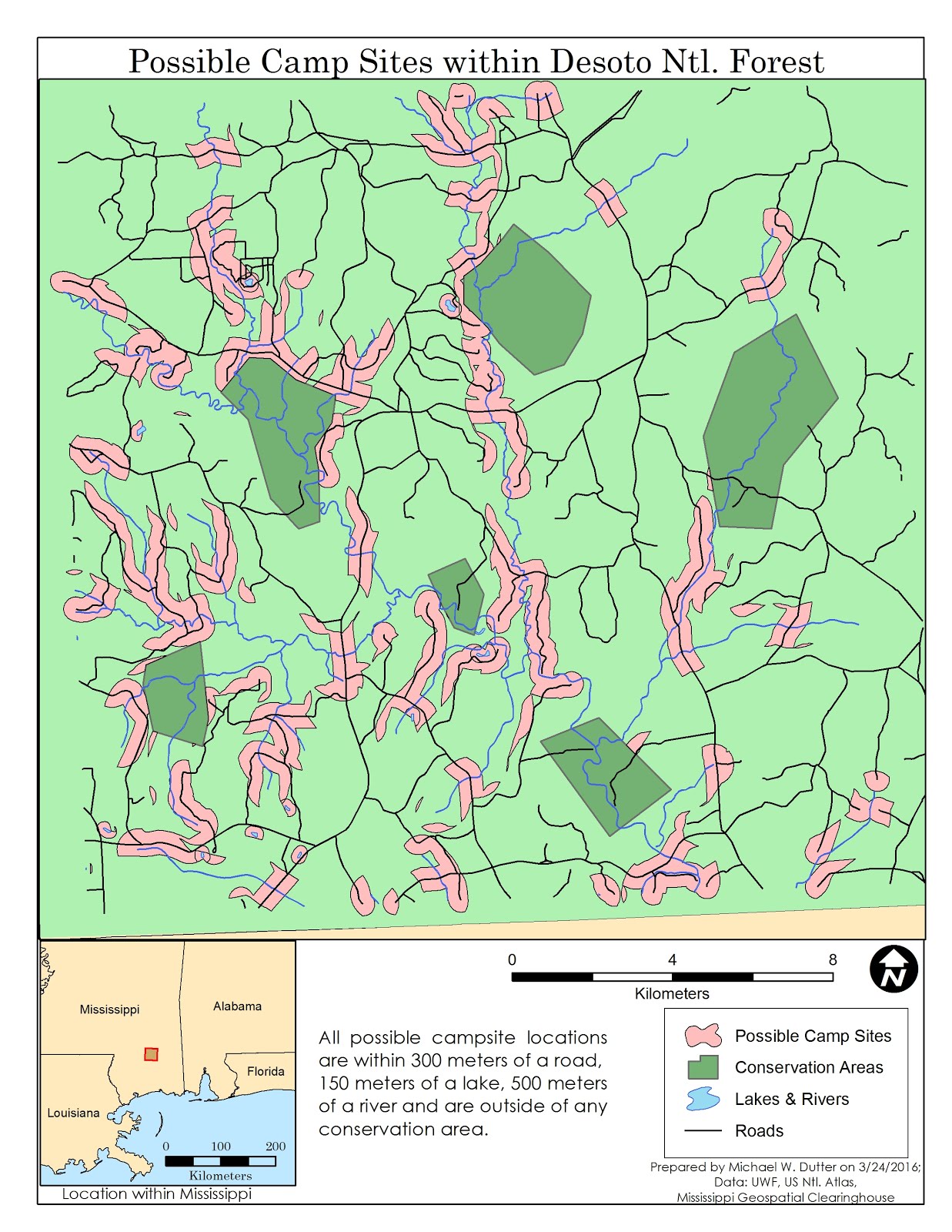
This weeks class objective was ti use buffer tools to perform a vector analysis. The task was to determine the best possible location for camp sites based on certain parameters. We were given feature classes of roads, rivers, lakes and conservation areas within Desoto National Forest.
First, before I dove into the pdf guide, I downloaded some shape files from the Mississippi Geospatial Clearing house. (I knew where Desoto was located). The files were parks & reserves, state boundaries and county boundaries. I wanted to see where exactly this data was located as well as provide a base map to make it more aesthetically pleasing and detailed as opposed to having lines and polygons floating in an ambiguous space. Using these layers, I figured out that the given feature classes were inside Desoto National Forest that was inside of Perry County, Mississippi (So, not the whole forest).
I then added the base layers and created an insert using the state boundary maps. I put our feature classes on top and then followed the pdf verbatim. The buffering was quite straight forward, if you knew what tool works best. We were tasked with joining the buffers of the rivers with the roads. I found the intersect tool worked best because it only took one step as opposed to several with the union. The next part was to find the buffers that intersected at within the buffers of both the water features (150m for lakes, 500 m for rivers) and the roads buffer (300m). Once I found those, I then had to erase buffers that were inside conservation areas. For this, I used the erase tool. Once I used the tools to determine the best places for camp sites, the next task was making it look good.
For that, I map the forest a light green. I left the conservation areas with a dark green. Though the examples given don't have the conservation areas displayed, I felt it best to display it so people could better understand how the best places to camp came to be. (If you knew the area within a certain distance of roads and water is where the best camp spots are you would be curious why some of those spots were missing from the map even knowing that it excluded conservation areas.)
I then added the insert map, the title, legend, neatline and north area. I tried to keep the map simple in terms of placement and color to keep it aesthetically pleasing. When it comes to design, I'm a minimalist.
First, before I dove into the pdf guide, I downloaded some shape files from the Mississippi Geospatial Clearing house. (I knew where Desoto was located). The files were parks & reserves, state boundaries and county boundaries. I wanted to see where exactly this data was located as well as provide a base map to make it more aesthetically pleasing and detailed as opposed to having lines and polygons floating in an ambiguous space. Using these layers, I figured out that the given feature classes were inside Desoto National Forest that was inside of Perry County, Mississippi (So, not the whole forest).
I then added the base layers and created an insert using the state boundary maps. I put our feature classes on top and then followed the pdf verbatim. The buffering was quite straight forward, if you knew what tool works best. We were tasked with joining the buffers of the rivers with the roads. I found the intersect tool worked best because it only took one step as opposed to several with the union. The next part was to find the buffers that intersected at within the buffers of both the water features (150m for lakes, 500 m for rivers) and the roads buffer (300m). Once I found those, I then had to erase buffers that were inside conservation areas. For this, I used the erase tool. Once I used the tools to determine the best places for camp sites, the next task was making it look good.
For that, I map the forest a light green. I left the conservation areas with a dark green. Though the examples given don't have the conservation areas displayed, I felt it best to display it so people could better understand how the best places to camp came to be. (If you knew the area within a certain distance of roads and water is where the best camp spots are you would be curious why some of those spots were missing from the map even knowing that it excluded conservation areas.)
I then added the insert map, the title, legend, neatline and north area. I tried to keep the map simple in terms of placement and color to keep it aesthetically pleasing. When it comes to design, I'm a minimalist.
Friday, March 4, 2016
Data Searchin'
Week 7 and 8 was all about hunting for the data. That meant (literal) hours of downloading from the various websites (FGDL and Labins). Given the fact I'm in the People's (non) Republic of China, the internet is not the fastest especially when I have my VPN running to get to most of the data.
Once I had the data I wanted, it was time to build the map in Arc. The first issue I encountered was the projection. Initially, I added the vector data I wanted and then projected that data into State Plane. I then added the raster data (aerials) and it ended up somewhere in the atlantic despite having the same datum and projection as the frame. This was well, annoying. I did a lot of research and a few GIS blogs mentioned that with projections, UTM and state plane were troublesome in ARC. After some troubleshooting of my own, I decided to see if the order in which I "layered" the map would make a difference...and it did. Hopefully this wasn't something I glossed over in this course. So I put in the raster data first, then the vector and it all lined up. I could project and reproject to my heart's content and all was well.
St. Joseph Bay Invasive Plants:
I decided to go with wetlands in my map, however, Gulf county Florida seems to be nothing but wetlands...I then added a managed (conservation) layer (that I clipped). I clipped the wetlands layer to the managed layer. So now my map only shows wetlands inside the managed areas (surprisingly, not much given the sensitivity). I used this in my St. Jospeh bay map. I then layered the invasive plants layer on top. I finally added an aerial of St. Joseph state park (with the plants on top). I added a insert to show the location within Gulf county. Everything is projected in State Plane.
Invasive Plants in Managed Areas, Gulf County, FL
I overlaid the managed areas with the state park layer and the Fish and Wildlife Commission managed areas layer so in my invasive plant wide Gulf county map, you could see who owns what. The pink is privately managed land. In the southern portion of the FWC area, the invasive plants clump up, so I created an insert to make out it better. Everything is projected in State Plane.
Once I had the data I wanted, it was time to build the map in Arc. The first issue I encountered was the projection. Initially, I added the vector data I wanted and then projected that data into State Plane. I then added the raster data (aerials) and it ended up somewhere in the atlantic despite having the same datum and projection as the frame. This was well, annoying. I did a lot of research and a few GIS blogs mentioned that with projections, UTM and state plane were troublesome in ARC. After some troubleshooting of my own, I decided to see if the order in which I "layered" the map would make a difference...and it did. Hopefully this wasn't something I glossed over in this course. So I put in the raster data first, then the vector and it all lined up. I could project and reproject to my heart's content and all was well.
St. Joseph Bay Invasive Plants:
I decided to go with wetlands in my map, however, Gulf county Florida seems to be nothing but wetlands...I then added a managed (conservation) layer (that I clipped). I clipped the wetlands layer to the managed layer. So now my map only shows wetlands inside the managed areas (surprisingly, not much given the sensitivity). I used this in my St. Jospeh bay map. I then layered the invasive plants layer on top. I finally added an aerial of St. Joseph state park (with the plants on top). I added a insert to show the location within Gulf county. Everything is projected in State Plane.
Invasive Plants in Managed Areas, Gulf County, FL
I overlaid the managed areas with the state park layer and the Fish and Wildlife Commission managed areas layer so in my invasive plant wide Gulf county map, you could see who owns what. The pink is privately managed land. In the southern portion of the FWC area, the invasive plants clump up, so I created an insert to make out it better. Everything is projected in State Plane.
DEM Gulf County
This one was pretty straight forward. Also, I didn't reporject. The DEM is in Albers Conical. I realized though, I should've added a blue background Gulf of Mexico and St. Joseph Bay). My original thinking was that the 0 elevation would line up with the Gulf. However, not a great idea.
Labels:
ArcGIS,
Data Search,
Florida,
Gulf County,
Week 7,
Week 7-8,
Week 8
Thursday, February 18, 2016
Projections Part 2: Half the battle
The thing I’ve learned about doing online classes is that
traveling and keeping up with the work are not easy. I’ve spent the last 2
weeks travelling between Asia and North America. Between the 15 hour flights,
jet leg and new hotels, there is a general screwing with my schedule. Also,
Starbucks is my new favorite place since it offers free Wi-Fi, like everywhere
(though one must pay 3 bucks for a coffee which offsets the free-ness of said Wi-Fi).
That being said, I will say learning projections has been interesting. Now, a
lot of this material was covered in my concurrent cartography class but working
with it in Arc was good. Though, I slowly, painfully learned the difference
between defining and reprojecting. If I’m not mistaken, it seems vector data is
the data to reproject because it has already been defined. The raster data I
had to define. Once I figured out how to ensure to project my data cleanly, it
was like solving a nice little puzzle. Now that I’m familiar with it, I realize
how important this will be for my future work in GIS.
In creating the final map product, I decided to go with
Pensacola. I figured working with an urban area would be easier for some irrational
reason. I found Pensacola by going to the quad search and searching by city
name. I then randomly picked a number for the numbers listed under Pensacola,
5259. Using that, I put it in the map. Initially, I was having problems putting
in the county boundaries, the x/y coordinates from the excel spreadsheet and
the major roads. So, I went back in the
instructions and carefully went through each step using the data I wanted to
use. The first time I went through the pdf was on my flight, with a women
placing her feet on my arm rest and the man next me taking up my leg area with
his legs (there is no personal space in China… L
). This time, I got it right. The processing projecting raster data
(othrophotos, .tiff) is different from vector data. With the raster I used the
define projection tool and with the vector data, I reprojected the data using
the project tool (data management). A
lot of my trouble shooting in ensuring the projections matched up, was opening
and closing ArcGIS. I noticed, when you first open an Arc map there is no
projection for the data frame. The projection then comes from the first layer
added. If you remove that layer and add a new layer with a different
projection, there is a conflict that is created because the data frame is using
the projection from the first dataset. When defining projections or
reprojecting, I had to make sure the GCS lined up. The way I did this was by
double clicking the XY coordinate system in the Spatial Reference Properties,
this opens a new dialogue, the Projected Coordinate System Properties. Here,
you can change the GCS by selecting change and picking a new one. I didn’t do
the transformation when the conflicts were first detected when adding the
layers. I did it initially, but I found I had a lot of errors. I used the
projection tools. Here, I felt I had more control over the projections.
Subscribe to:
Posts (Atom)